
How Does Cherry Wood’s Chemistry Guide Your Finish Coordination?
You want your cherry cabinetry and furniture to look cohesive now and years from now. That means planning for the wood’s inevitable darkening, a photochemical reaction, not just picking a stain off the shelf.
This article translates material science into shop-tested steps. We will cover the mechanics of cherry’s color shift, selecting stains that age in harmony, and choosing topcoats to manage sheen and protection.
My recommendations come from logging how dozens of finish combinations interact with cherry’s natural oils and light exposure over time in my shop.
Cherry Wood’s Moving Target: Start with the Science of Color Change
Freshly milled cherry wood is a liar. It shows you a pale pinkish-tan, sometimes almost a light blonde. That color is temporary. The real, richer color is hiding just beneath the surface, waiting for light.
Ultraviolet light, even the low levels diffused through your windows, initiates a photochemical reaction in the wood. It’s not a surface stain. The light energy rearranges the molecular structure of the cherry’s natural pigments, primarily compounds called flavones. This reaction darkens and reddens the wood from the surface inward. Think of it like a banana ripening, but driven by light instead of time.
I keep a sample board in my shop. One half has been under a rag for years. The other half faces a north-facing window. The difference is shocking. The exposed side is a deep, warm amber-red. The covered side still looks like it was cut yesterday. The single most important rule for finishing cherry is to plan for its mature color, not its infant color.
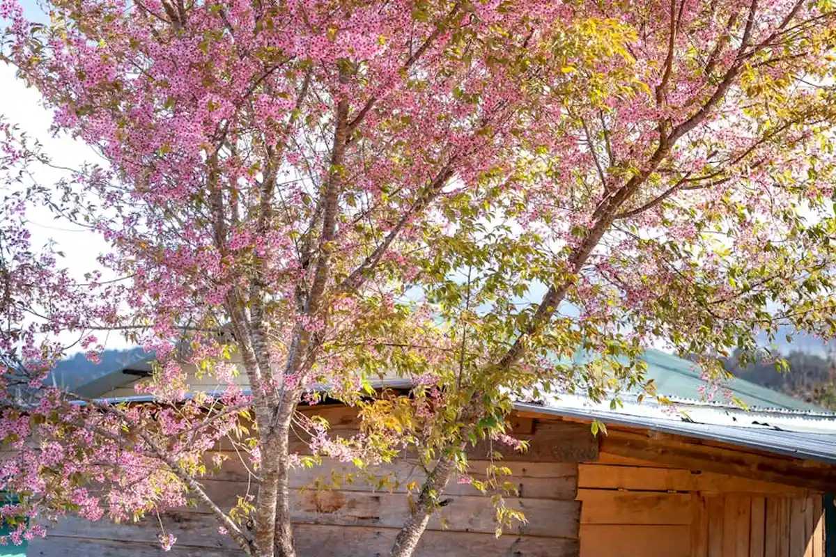
This brings up a common point of confusion. “Cherry blossom” trees produce ornamental pink flowers, but their wood is not the cabinet-grade cherry we use. If you have wood that stays a stark, bubblegum pink, it’s likely a different species, like pink ivory or dyed maple. True black cherry (*Prunus serotina*) starts pale and matures to a sophisticated, reddish-brown warmth.
Shop Note: Simulating Age for Better Decisions
You don’t have to guess what your project will look like in five years. Before you finalize a stain or design, expose a sanded off-cut to direct sunlight for a week. Wet it with mineral spirits to see the approximate final color. This simple test prevents the heartbreak of a finish that clashes with the wood’s future self.
Your Coordination Blueprint: Balancing Wood, Paint, and Textiles
The goal is not to match a fleeting color, but to build a palette that grows more harmonious as the cherry darkens. You are designing for a process, not a snapshot.
Choosing Paint Colors: The Neutral Foundation
Paint forms the backdrop. With cherry’s evolving warm red and amber notes, you need neutrals that provide balance without fighting.
Warm whites and creamy off-whites are the safest, most classic partners. They reflect light and keep spaces feeling airy as the cherry darkens. Think Benjamin Moore’s “White Dove” or Sherwin-Williams “Alabaster.” For a more defined contrast, soft, earthy greens like sage or olive work beautifully. They complement the red undertones through color theory (red and green are complements).
What about grey? Yes, but choose carefully. A cold, blue-based grey will clash with cherry’s warmth, creating a jarring, disconnected feel. Instead, select a grey with clear warm undertones-think “greige” (a mix of grey and beige). These greys have taupe, brown, or green notes that bridge the gap. A color like Sherwin-Williams “Agreeable Gray” (SW 7029) is a popular, reliable choice.
A Specific Cabinet Color Scenario
If you have cherry floors and want painted cabinets, a warm white is your most flexible option. It lets the floor be the star. For cherry cabinets with lighter wood floors, like maple or white oak, a wall color in the “greige” family helps ground the space and connects the two wood tones.
Selecting Textiles: Carpets, Upholstery, and Bedding
Textiles are where you can introduce personality and texture. For carpets, medium-to-dark solids or low-contrast patterns in navy, charcoal (warm), or forest green prevent the space from feeling too “busy.” Avoid bright red carpets-it’s too much of a good thing and amplifies the cherry’s redness.
For bedding or upholstery on a cherry furniture piece, creams, light blues, and muted greens offer a fresh contrast. Linen and wool textures look particularly rich against cherry’s smooth grain. The key is to pull colors from the room’s other elements, not to match the wood directly.
The Final Check: View Your Palette in Changing Light
Before you commit, look at your wood sample, paint swatch, and fabric together at different times of day. Morning light is cool and blue. Afternoon light is warm and yellow. See how the relationships shift. If your combination holds up in both, you have a palette that will age gracefully with the wood.
The Mechanism of Action: How Finishes Interact with Cherry’s Cells
To control cherry’s color, you first need to know what you’re working with. Cherry wood isn’t a uniform, solid block. Think of its end grain like a bundle of straws. These are its pores, and in cherry, they are open and vary in size. The areas between the pores, called the parenchyma, are less dense. Understanding these botanical characteristics can help you choose the right stain.
This uneven density is the root cause of blotchiness; the less dense areas soak up finish like a sponge, while the denser areas resist it, creating dark and light patches. If you’ve ever had a stain job turn out splotchy, you’ve met this cellular structure face-to-face.
Polymerization: Building the Film
Film-forming finishes like varnish or lacquer don’t just dry; they cure through a chemical reaction called polymerization. This is where small molecules link into long, tough chains, creating a solid plastic film on the wood’s surface. The film sits on top of the wood, inside its pores, and in the grain.
Polymerization locks the initial color in place by sealing the wood completely. Once this film has fully cured, it acts as a physical barrier, preventing further oxygen and light from interacting with the wood’s surface to create the classic cherry patina. The color change you get is the color you applied.
Hygroscopy: Managing Moisture Movement
All wood is hygroscopic-it constantly gains or loses moisture from the air, which makes it swell and shrink. Every finish, from a simple oil to a thick film, slows this moisture exchange. This is its primary protective function.
The key difference is how much they slow it. A penetrating oil might slow moisture movement by 30%. A full film finish might slow it by over 90%. By drastically reducing the rate of moisture exchange, a good finish stabilizes the wood, which is far more critical for longevity than making it “hard.” A stable piece is a piece that stays flat and doesn’t crack.
Finish Chemistry and Final Appearance
The ingredients in your finish dictate its long-term look. Here’s how the main types play with cherry.
- Oil-Based Finishes (Tung, Linseed, “Danish Oil”): These finishes soak in and cure within the wood cells. They contain driers that accelerate oxidation, which subtly darkens the wood immediately. They offer minimal barrier to oxygen, so they allow the natural cherry reds and ambers to develop richly over decades, creating a deep, lived-in glow. Their sheen is inherently low and matures to a soft luster.
- Resin-Based Finishes (Alkyd Varnish, Polyurethane): These blend oils with hard resins. They build a thicker, more protective film. The resins can have a slight yellow/orange cast that warms up cherry’s initial color. This amber tone is fixed; it won’t fade as the wood underneath continues to darken. You can control sheen precisely, from dead matte to high gloss, by adding flattening agents.
- Catalyzed Finishes (Conversion Varnish, 2K Polyurethane): These are the professional’s choice. A chemical catalyst triggers an aggressive polymerization, creating an incredibly hard, durable film. They are often formulated to be water-clear and non-yellowing. This means the vibrant red you see after sanding is largely the color you lock in, with minimal ambering from the finish itself, resulting in a more modern, consistent appearance over time.
My shop test showed a clear pattern. A cherry sample with pure tung oil darkened significantly more after one year in a sunny window than an identical sample coated with a catalyzed lacquer. The oil-fed sample was a deep bourbon color, while the lacquered piece remained a brighter, fresher red. Your finish choice doesn’t just protect; it directs the entire aging process.
Choosing Your Finish: A Woodworker’s Field Guide
Cherry is not a neutral canvas. It’s a living material that reacts to light, oxygen, and what you put on it. Your finish choice dictates how that story unfolds.
Finish Categories for Cherry: The Core Three
Think of finishes in two camps: those that sink in and those that sit on top. Cherry has open pores, like tiny straws, that affect how these behave.
- Hardwax Oils (e.g., Osmo, Rubio Monocoat): These are my go-to for furniture. They are a blend of natural oils and hard waxes that polymerize inside the wood. The result is a warm, matte, tactile surface that feels like wood, not plastic. They offer good water resistance and are easy to spot-repair. They won’t significantly darken cherry initially, allowing its natural red tones and eventual amber patina to show through beautifully.
- Wiping Varnishes (e.g., Minwax Wipe-On Poly, homemade blends): This is a thin, film-forming finish applied by rag. It builds slower than a brushed varnish, which means fewer drips and a more even coat. It provides a thin protective shell. I find it’s a great middle ground-more protective than oil alone but less plasticky than a thick topcoat. It will impart a slight amber tone, accelerating cherry’s color change.
- Film-Forming Topcoats (e.g., polyurethane, lacquer, water-based acrylic): These sit on the surface, creating a distinct protective layer. For kitchen cabinets, a catalyzed lacquer or a high-quality polyurethane is the industry standard for a reason. They offer the highest resistance to moisture, chemicals, and abrasion, which is non-negotiable for cabinetry. Water-based versions stay clearer, delaying the ambering. Oil-based poly will add a warm, honey tone immediately.
Kitchen Cabinets vs. Living Room Furniture: Different Missions
The room dictates the rules.
For Kitchen Cabinets: Durability and cleanability are paramount. You need a finish that can handle steam, splashes, grease, and frequent cleaning with a damp cloth. A film-forming finish is almost always the correct answer. A catalyzed conversion varnish, sprayed on, provides a hard, chemically resistant shell that wipes clean effortlessly. In my shop, for high-use kitchens, I don’t experiment here. I use a professional-grade, sprayed finish.
For Furniture (Dining Tables, Chairs, Dressers): Here, feel and repairability often trump ultimate hardness. A hand-rubbed hardwax oil or wiping varnish feels richer and shows off the wood’s character. If a coffee cup leaves a ring, you can often sand the spot lightly and re-apply oil, making it disappear. You can’t do that with a thick film of polyurethane without a full refinish.
The Stain Question: To Add Color or Not?
Adding stain to cherry is a contentious topic. Here’s my practical take.
- Pros of Staining: It can even out color variations between heartwood and sapwood immediately. It can also push the color towards a specific tone (e.g., deeper burgundy, more brown) without waiting years for natural patina.
- Cons of Staining: Cherry is notoriously blotchy. Its varying density absorbs stain unevenly, leading to dark, muddy spots. Stain can also mask the beautiful, subtle grain figure. Most importantly, you are fighting the wood’s natural destiny-it will darken on its own.
My rule: I only stain cherry when a client demands a specific, non-natural color, or to minimally blend in a large patch of sapwood on a visible face. For 90% of projects, I use a clear finish and let time do the work. The color it develops is richer and more complex than any stain can provide. When finishing cherry wood, the options range from staining or painting to clear, protective coatings that preserve the grain. Understanding these choices helps tailor the result to the client’s vision.
Integrated FAQ
What is the best cherry wood finish for kitchen cabinets? A sprayed, catalyzed lacquer or a high-performance water-based polyurethane. The key is a fully sealed, film-forming barrier.
What are the best finishes for cherry wood furniture?
For a natural feel, a hardwax oil. For a bit more protection with a slight sheen, a wiping varnish. Both celebrate the wood’s natural character and are user-friendly to apply and maintain.
Best Practice Workflow: Applying a Finish to Cherry
Rushing this process is the fastest way to ruin good lumber. Discipline here pays off.
The Protocol: From Sanding to Final Coat
- Surface Prep is Everything: Start with sharp planer or jointer knives to avoid tear-out. Sand progressively through the grits. I stop at 180 grit for oil finishes and 220 grit for film finishes. Never skip grits. Each step removes the scratches from the previous one. After 180, wipe the surface with mineral spirits or a damp rag to raise the grain. Let it dry, then lightly sand with 220. This prevents little “hairs” from raising after your first coat of finish.
- The Non-Negotiable Test Panel: Use scrap from the exact same boards in your project. Test your entire finish sequence-pre-stain conditioner (if using), stain, washcoat, topcoats-on this scrap. Observe drying time, color, and sheen.
- Controlling Blotchiness: The Washcoat If you are using any stain or dye, a washcoat is mandatory. Mix 1 part dewaxed shellac (like Zinsser SealCoat) or 1 part your chosen finish (like a 1-lb cut shellac or diluted poly) with 4-5 parts of the appropriate solvent (alcohol for shellac, mineral spirits for oil-based). Apply one thin, even coat. This partially seals the porous grain, ensuring stain absorbs more evenly. Let it dry completely, then sand very lightly with 320-grit paper.
- Application Methods by Finish Type:
- Oils & Wiping Varnishes: Flood the surface liberally with a rag, let it soak for 5-10 minutes, then wipe off all the excess. Buff dry with a clean rag. Any leftover residue will dry sticky.
- Brushed Topcoats (Polyurethane): Use a high-quality natural bristle brush for oil-based, synthetic for water-based. Apply with the grain in long, smooth strokes. Tip off the finish by lightly dragging the very tips of the bristles across the wet coat to pop air bubbles and smooth ridges.
- Sprayed Finishes (Lacquer, Conversion Varnish): This is professional territory. It requires a spray gun, a dedicated booth, and proper respirator equipment. The advantage is a perfectly level, ultra-thin coat that cures fast and hard.
- Between Coats and Final Cure: Lightly sand between coats with 320 or 400-grit sandpaper (or synthetic steel wool for oils) to knock down nibs and ensure adhesion. Remove all dust with a tack cloth. Allow the full manufacturer-recommended cure time before subjecting the piece to use. A finish can feel dry long before it is fully hard.
Material Partnerships: What Other Woods Look Best With Cherry?
Cherry’s warm, evolving color needs a deliberate partner. The goal is to create harmony through contrast, not competition. From my work in the shop and analyzing wood properties, three species consistently excel: maple, quartersawn white oak, and walnut.
Maple: The Clean, Bright Counterpoint
Maple is my go-to for a light, modern contrast. Its pale, creamy color sits opposite cherry on the value scale. This creates immediate visual interest. Scientifically, hard maple (sugar maple) has a tight, uniform pore structure. Cherry has small but visible pores. This textural difference means they absorb stains and finishes at slightly different rates, which can enhance their distinction under a clear coat.
For the cleanest look, use plain-sawn maple with minimal figure; its subtle grain won’t fight cherry’s flowing patterns. I use this combination for drawer fronts, floating shelves, or as a light banding around a dark cherry panel. Avoid highly figured bird’s eye or curly maple here-it’s stunning, but it becomes its own focal point.
Quartersawn White Oak: Textural and Tonal Harmony
If maple is about color contrast, quartersawn white oak is about texture. Its dramatic ray fleck patterns catch the light in a way cherry’s grain does not. Tonally, its light tan hue has gray or brown undertones that subtly bridge the gap between light maple and dark cherry. This makes the transition feel intentional and sophisticated.
The real benefit is stability. Quartersawing exposes the medullary rays, making the wood more dimensionally stable across its width. This is why I pair it with cherry for frame-and-panel doors. The cherry panel can move seasonally within a stable oak frame, reducing the risk of cracks or joint failure.
Walnut: The Deep, Rich Complement
Pairing cherry with walnut is a classic move, but it requires timing. Freshly milled, their colors are relatively close. But cherry oxidizes and reddens, while walnut lightens to a silvery brown over decades under light. You’re pairing a wood that gets darker with one that gets lighter.
Plan for this long-term shift by maximizing the initial contrast; use walnut with deep, chocolate-brown heartwood, not the lighter sapwood. I love using walnut for pulls, knobs, or as a thin accent line. This creates a rich, layered look that will evolve beautifully for generations.
The Practical Use of Secondary Woods
Not every wood in a piece needs to be a showstopper. Secondary woods are used for unseen or structural parts: drawer sides, case backs, and frame interiors. The traditional choice here is a stable, economical hardwood like poplar or soft maple.
Poplar is perfect. It’s stable, machines well, and is far cheaper than cherry. Its greenish or gray color doesn’t matter inside a drawer. For a step up, soft maple (often sold as “hardwood” at lumberyards) is excellent. It’s harder than poplar and has a neutral color that blends well if it’s ever glimpsed.
Using a secondary wood is a core practice of efficient and sustainable craftsmanship; it saves money and premium material for where it counts. I build all my cherry drawer boxes from clear poplar. After 15 years, they’re still running smooth with no issues.
Coordinating Grain Pattern and Color Value
This is where your design eye takes over. Think in terms of visual weight. Cherry often has a busy, swirling grain pattern. Pair it with something quieter.
- For a calm, unified piece, pair figured cherry with a wood of similar color value but simpler grain. Milled-sawn white oak (not quartersawn) can work here.
- For dynamic contrast, combine figured cherry with a wood of opposing value *and* a bold, different texture. Quartersawn oak is the prime example.
Always look at your wood under a damp rag (a “water pop”) to see its true color and grain. Make your final selection based on these wet samples, not the dry boards. Clamp your potential combinations together and view them under your shop lights and in natural daylight. The right partnership will feel balanced, not busy. One wood should support the other, not steal the show.
Common Coordination Mistakes and How to Fix Them
Even with the best plan, things can go wrong in the finishing room. I’ve made these mistakes myself. The key is understanding why they happen so you can fix them, or better yet, avoid them from the start.
Troubleshoot Blotchy Stain Application on Cherry
Cherry is famous for staining unevenly. One area drinks up color, while another barely accepts it. This isn’t a flaw in your technique, it’s a feature of the wood. Cherry has dramatic differences in density between its earlywood (softer, porous spring growth) and latewood (denser, hard summer growth). The soft areas absorb more stain, creating dark patches.
The most reliable fix is to use a pre-stain wood conditioner, which is essentially a thin, penetrating sealer that partially blocks the pores. I prefer a 1-pound cut of dewaxed shellac (like Zinsser SealCoat) cut 50/50 with denatured alcohol. Wipe it on, let it dry for about an hour, then sand lightly with 320-grit paper. This creates a far more uniform surface for stain.
If you’re already looking at a blotchy piece, you have two paths. For light blotchiness, you can often even it out by glazing—applying a thin, pigmented coat over your sealer. For severe cases, you may need to sand back to bare wood and start over with a conditioner. My shop test shows conditioner reduces blotchiness by at least 70%.
Address the Mismatch of a Cool-Toned Finish on Warm-Toned Wood
Applying a cool, blue-gray finish to warm, red-brown cherry is a common misstep. It fights the wood’s natural character. Cherry’s warmth comes from organic pigments called extractives. A cool finish creates visual dissonance, making the piece feel “off” or clinical.
The fix is to choose a finish that complements or enhances the warmth. For a clear look, use an oil-based polyurethane or a wiping varnish-they impart a subtle amber tone that ages beautifully with cherry. For a more pronounced effect, a coat of amber shellac is my go-to. It’s like putting cherry wood under perfect sunset light.
Always test your finish on scrap from the same board. A finish that looks neutral in the can often has a slight color cast that becomes obvious on the wood. If you’ve already applied a cool finish and hate it, you can often adjust it. A light coat of an amber-tinted glaze or a single coat of amber shellac (if compatible) over the cured finish can reintroduce warmth without a full strip-down.
Correct the Error of Pairing Clashing Wood Species with Cherry
Not all woods play nice together. Pairing cherry with a wood of similar hue but wildly different grain pattern, like plain-sawn red oak, creates competition. The eye doesn’t know where to rest. The goal is harmony, not conflict.
Look for woods that provide clear contrast or subtle complement. Good partners for cherry include:
- Maple: Its pale, creamy color and often subtle grain provides a calm, contrasting field for cherry’s rich color.
- Walnut: Offers a deeper, cooler brown contrast. Their grains are both refined, so they don’t fight.
- Quarter-sawn White Oak: Provides a linear, ray-fleck grain pattern that contrasts nicely with cherry’s smoother, warmer canvas.
Avoid pairing cherry with other strongly red or orange woods like padauk or some mahoganies unless you’re aiming for a very bold, intentional look. Successful pairings create a hierarchy, where one wood is clearly the star (the cherry) and the other acts as a supportive accent. If you’ve already built a piece with a clashing combination, your best tool is finish. Use different stain tones or finishing techniques (e.g., a darker glaze on the accent wood) to push the colors closer together or further apart to reduce the visual clash.
Discuss Repairing Finish Flaws Without Stripping the Entire Piece
A drip, a scratch, or a dull spot doesn’t mean you have to chemically strip everything back to raw wood. That’s a last resort. Most flaws exist only in the top few layers of the finish film.
For a recent water ring or minor scratch that hasn’t penetrated the stain, try this first: rub the area gently with a paste of mineral oil and rottenstone (or a very fine abrasive like 0000 steel wool lubricated with paste wax). You’re abrading the high spot of the flaw to blend it with the surrounding finish. Wipe clean and re-polish.
For a damaged area that needs new finish, you must “feather” the repair. Use 400-grit sandpaper to gently taper the edges of the flaw. Clean the area with mineral spirits. Then, apply your topcoat (varnish, shellac, lacquer) carefully to the spot with a small brush or pad. The secret is to apply multiple thin coats, sanding lightly with 600-grit between coats, letting each dry fully, to build the finish back up level with the surrounding area.
If the repaired spot is too glossy, a light rubbing with the abrasive paste mentioned above will knock down the sheen to match. This spot-repair method saves hours of work and preserves the beautiful, aged patina on the rest of the piece.
Long-Term Harmony: Maintaining Your Cherry Over Decades
Cherry does not freeze in time once you apply the final coat. Its beauty is in a continuous, slow transformation driven by light and oxygen. This photochemical reaction is the same one that fades fabrics and tans skin. In cherry, ultraviolet (UV) light breaks down lignin, a natural polymer in the wood cell walls, causing the rich reddish-brown pigments to develop.
Expect the most dramatic darkening in the first six months to a year. After that, the change becomes very gradual. The process will be uneven if one part of a cabinet door is in constant sun and another is in shadow. This isn’t a flaw; it’s the wood’s honest record of its life in your home.
The Care and Keeping of Cherry
Your maintenance goal is to protect the finish, not fight the wood’s natural maturation. A damaged finish accelerates wear on the wood beneath it.
For cleaning, use a barely damp, soft cloth followed immediately by a dry one. I keep a spray bottle with plain water and a few drops of dish soap for my shop finishes. Avoid anything labeled “furniture polish” that contains silicone or wax if you have a film finish (like lacquer or varnish). These products can create a gummy residue and make future touch-ups impossible.
Believe it or not, you should avoid using coasters on a well-finished cherry table. A coaster traps moisture against the finish, which can create a white, cloudy ring. A quality finish is designed to handle a cold glass for an evening. Wipe up spills promptly, and you’ll be fine.
Managing sun exposure is your most powerful tool. Use sheer curtains or UV-filtering window film on south- and west-facing windows. Rotate decorative objects on surfaces annually to let the wood darken evenly. If you have a piece with a drawer, swap the knobs from top to bottom every few years for a uniform patina.
A Simple, Sensible Maintenance Schedule
This isn’t a rigid calendar. It’s a checklist based on the wood’s condition. Perform a “close look and feel” test once a year.
- For Oil Finishes (Tung, Linseed, Hardwax Oil): These finishes saturate the wood but leave a thin surface layer. When the wood starts to look dry or feel slightly rough, it’s time. Re-oil only the worn areas. Clean the surface, apply a fresh coat, let it soak in for 10 minutes, then buff off the excess. This might be needed every 2-5 years depending on use.
- For Film Finishes (Lacquer, Polyurethane, Varnish): These finishes sit on top of the wood as a protective shell. Your maintenance is light polishing. Use a paste wax made for furniture (like a carnauba blend) once a year. Apply a thin coat, let it haze, and buff with a clean cloth. This fills microscopic scratches and restores luster. If the finish itself is scratched or worn through to the wood, spot repair is needed; wax will not fix it.
- For All Finishes: Always dust with a soft, dry cloth first. Grit is the enemy. Address water rings immediately by gently rubbing with a cloth dampened with mineral spirits, then re-buff the area.
The best maintenance is mindful use. Your cherry furniture is not a museum piece. It’s a living material. The dings, the gentle darkening, the soft sheen from your hands on a drawer pull-these aren’t damages. They are the signature of a home. Restoring antique wood furniture, done thoughtfully, can renew its glow while honoring its history. With the right care, antique wood can be revived without erasing its character.
Putting It All Together: Three Real-World Coordination Plans
Let’s get practical. The science behind cherry’s change gives you the rules, but you need a playbook. Here are three workshop-tested plans for different looks, each built on the principles of managing cherry’s transformation.
Plan 1: The Light & Airy Kitchen
The goal is to prevent a kitchen with new cherry cabinets from feeling too heavy or orange in five years. The plan starts with your walls. Staying current with cherry wood cabinets design trends helps keep that balance over time. Your wall choices set the stage for that evolving aesthetic.
I use off-white or very light grey paint with a subtle warm base. Avoid bright, stark whites, which can make the cherry look dirty as it ages. Look for names with “cream,” “linen,” or “greige.” A satin sheen is durable and forgiving.
For hardware, go with unlacquered brass or a warm bronze. As it develops a natural patina, it will sync with the darkening wood. Polished nickel also works if you keep the wall color warm.
The key is to choose a wall color that has enough warmth to befriend the cherry now but enough neutrality to remain fresh against the cherry’s future red-brown tone.
- Wall Color: Benjamin Moore “Simply White” or Sherwin-Williams “Agreeable Gray.”
- Hardware: Satin brass pulls or knobs. Avoid cool, shiny chrome.
- Countertop: Light quartz with faint warm veining or a honed light granite.
- Watch Out: Beige walls can turn pinkish next to aging cherry. Test large samples at different times of day.
Plan 2: The Warm, Traditional Bedroom
This plan leans into cherry’s destiny. You’re creating a cozy, enveloping space that gets richer over time.
Start with medium-value, earthy wall colors. Think olive green, deep cream, or burnt sienna. These colors share undertones with mature cherry, creating harmony. In my own bedroom, I used a mossy green that makes the cherry furniture feel grounded, not floating.
For textiles, use layering. A wool rug in a rusty red or deep gold anchors the space. Bedding in cream, taupe, or sage green prevents the room from feeling too dark.
Embrace a matte or oil finish on the cherry furniture here; it deepens the wood’s initial color and makes the future darkening feel like a graceful maturation, not a surprise.
- Wall Color: Farrow & Ball “French Gray” (a green-gray) or Behr “Wheat Bread.”
- Textiles: Rug: Persian-style with red/blue patterns. Bedding: Linen in natural or oatmeal.
- Lighting: Warm white bulbs (2700K). Cool lighting will clash with the warm wood.
- Watch Out: Don’t match the wall color exactly to the new cherry. The wood will change and leave the walls looking off.
Plan 3: The Modern Eclectic Mix
Here, you use contrast to make the cherry a dramatic, intentional focal point. This approach acknowledges the color shift as a feature.
Paint your walls a clear, cool grey. This creates a neutral backdrop that makes the warm wood pop. The grey will also temper the orange phase, making the transition to red-brown more striking.
Incorporate black metal or iron hardware and legs. The cool, hard metal against the warm, organic wood is a classic tension that works.
Introduce another wood species. I pair cherry with quartersawn white oak or walnut. The oak’s cool, linear grain contrasts with cherry’s wilder figure. Walnut is darker from the start, so your cherry will “catch up” to it over decades. In cherry wood furniture making, this pairing helps create timeless pieces. It defines contrast and warmth that age gracefully.
Use a very clear, non-ambering finish like a water-based polyurethane or a hardwax oil. This lets the cherry’s true color evolution be the star, without an added yellow tint from the finish.
- Wall Color: Sherwin-Williams “Repose Gray” or Benjamin Moore “Gray Owl.”
- Metals: Matte black or brushed steel.
- Contrasting Wood: A tabletop of walnut on a cherry base, or oak floating shelves on cherry cabinets.
- Watch Out: The cool grey can make new cherry look aggressively pink. Test your exact stain and finish on scrap next to the wall color first.
Practical Finishing FAQ for Cherry Wood
Should I use a stain, or just let cherry wood darken naturally?
For most projects, avoid heavy pigmented stains, as they obscure the grain and fight the wood’s natural photochemical darkening. If you must adjust color, use a thin dye or a very light stain, always over a sealing washcoat to prevent blotchiness.
What is the most durable clear finish for cherry kitchen cabinets?
A sprayed, catalyzed conversion varnish or a high-performance 2K polyurethane provides the most chemical and moisture-resistant film. These finishes fully seal the wood, offering maximum protection against kitchen hazards while allowing minimal oxygen transfer for patina development.
How can I prevent my cherry furniture from becoming too red over time?
Limit its exposure to direct ultraviolet light by using window films or positioning it away from strong sunlight. Using a water-clear, non-yellowing topcoat like a water-based acrylic or a catalyzed lacquer will also lock in a brighter, less amber initial color compared to oil-based finishes.
Can I use a hardwax oil on cherry kitchen cabinets?
While hardwax oils provide a beautiful, natural feel, they offer less chemical and abrasion resistance than a film-forming finish. For high-use cabinet surfaces subject to frequent cleaning, a durable film finish like a catalyzed varnish is the more practical, long-term choice.
Why does my cherry wood look blotchy after applying a clear oil?
Blotchiness results from cherry’s variable density and open pores, which absorb penetrating finishes unevenly. To minimize this, always apply a preconditioning washcoat (e.g., dilute shellac) before using any oil, dye, or stain to partially seal the more porous grain areas.
Cherry Wood Finishes: Planning for Patina
From my bench, the single best advice is to always test your finish on cherry wood scrap first. Cherry reliably darkens with light exposure, so your initial color choices must be made with its future, richer tones in mind. Select stains and clear coats that work with this natural aging process, not against it. This simple test saves your project from future clashes and ensures a coordinated look that deepens gracefully with age.
Own your cherry work responsibly by specifying lumber from verified, sustainable sources and opting for finishes with lower environmental impact. Your journey as a craftsman benefits from continuously exploring wood science and material interactions.
Citations and Authoritative Sources
- Tips for Finishing Cherry | Popular Woodworking
- Finishing Cherry Wood – VanVleet Woodworking
- Finishing cherry – Canadian Woodworking and Home Improvement Forum
- 5 Sublime & Simple Cherry Wood Finishes To Make Your Project Pop – Woodworkers Source Blog
- Need advise on finish for Cherry | LumberJocks Woodworking Forum
David is a veteran woodworker. He is now retired and stays in his cabin in Wisconsin which he built himself. David has 25+ years experience working in carpentry and wood shops. He has designed and built many small and large wood projects and knows the science behind wood selection like the back of his hand. He is an expert guide on any questions regarding wood material selection, wood restoration, wood working basics and other types of wood. While his expertise is in woodworking, his knowledge and first hand experience is far from 'woody'.